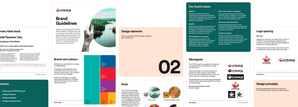
Brand refresh
Took the original logo that was re-designed in-house in 2020, updated the font, changed the text from a light grey to a dark (almost black) grey and finally softened all the sharp points making the logo appear a little more friendly to match its colour pallet.
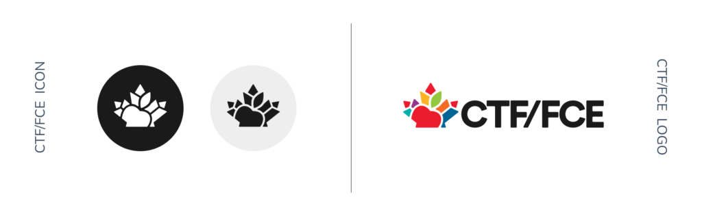
As part of the brand update, I expanded the colour pallet to include secondary colours, defined more clearly the look and feel for CTF/FCE, created a new letterhead, updated all the signage in the office, as well as some updates on the website.
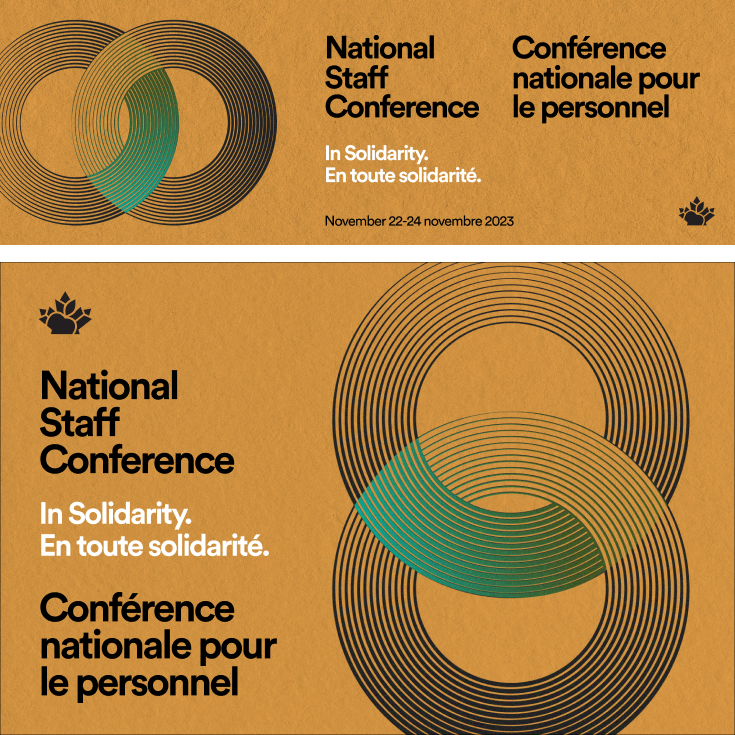
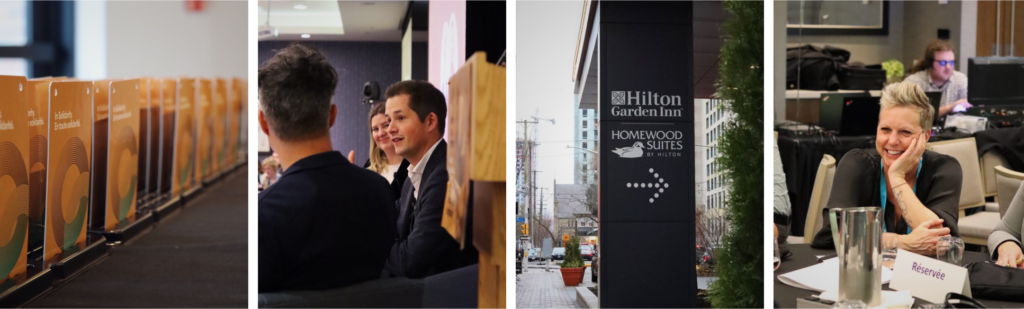
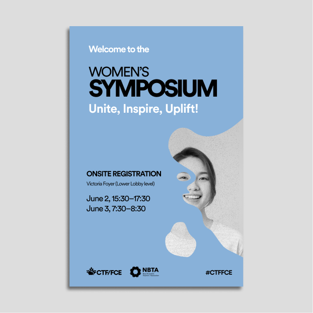
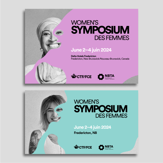
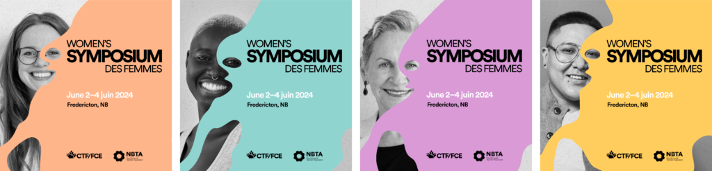
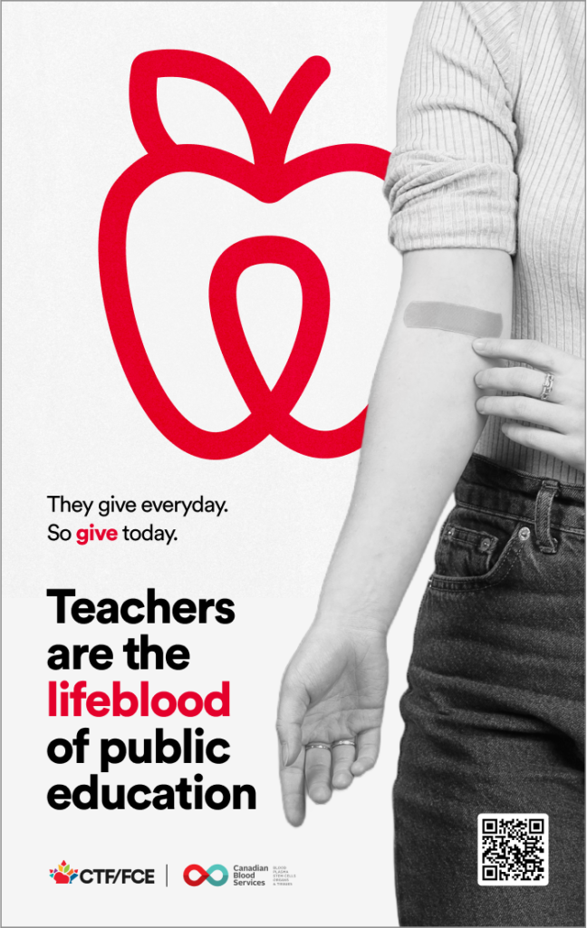
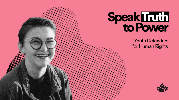
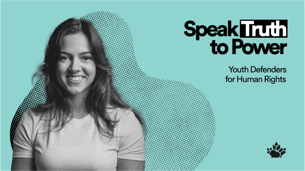
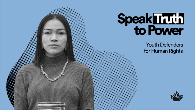
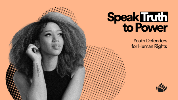
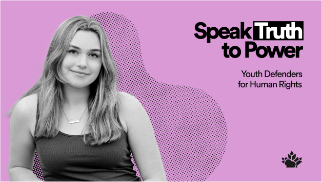
Events
As part of the Public Affairs team, we host and plan a lot of events both internally and externally.
Here are two of my favourites:
I was also designated photographer for this event.


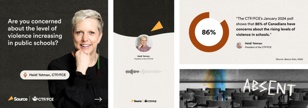
Social media

Lesson plans
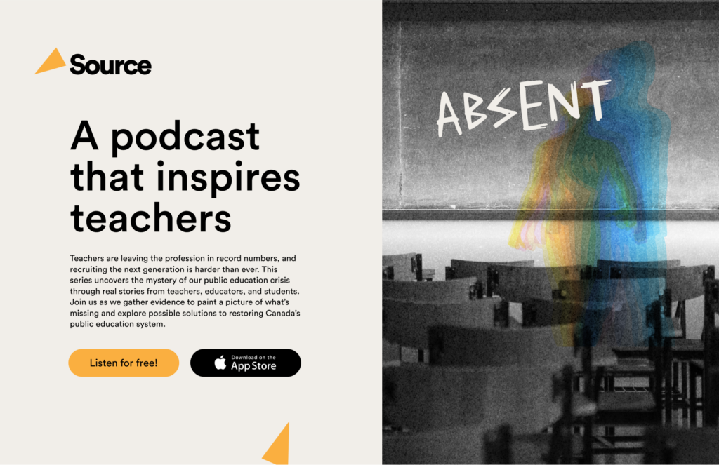
Podcast